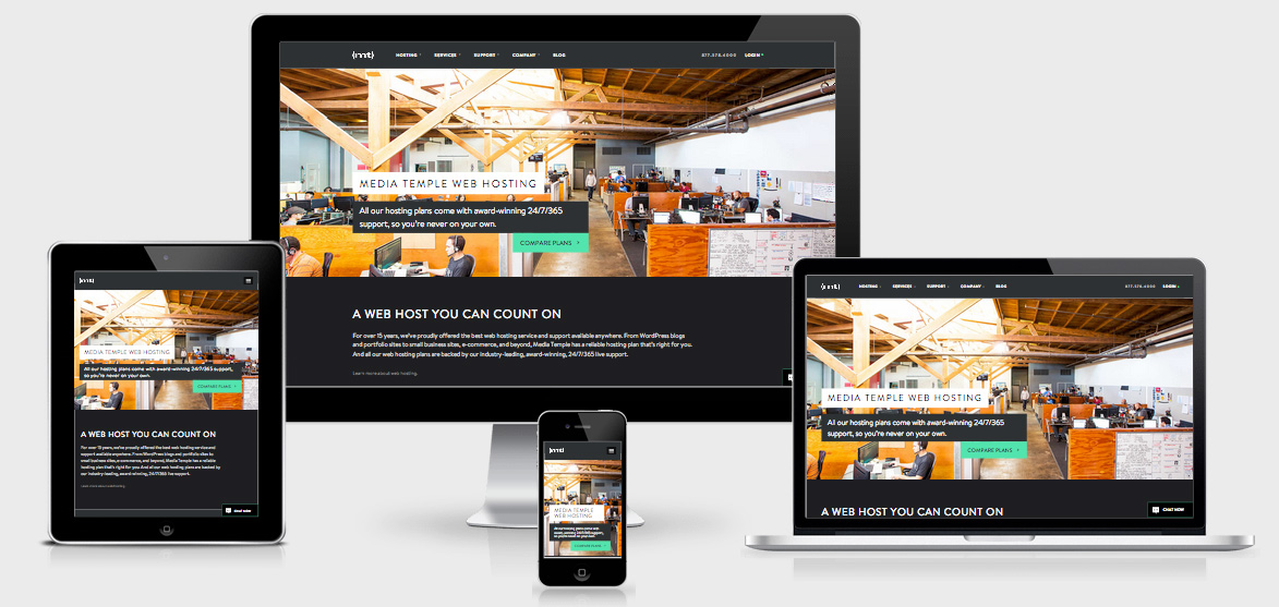
Media Temple
There are 246 @media queries bubbled through the entire CSS file. When the CSS file is formatted and spaced it exceeds a whopping 8000+ lines.
In the chrome dev tools we have the following load times
116 requests ❘ 1.2 MB transferred ❘ 12.03 s (load: 8.35 s, DOMContentLoaded: 7.97 s).
MediaTemple have squeezed quite a bit of performance out of the page by even using a lazy loading technique to load images only once they’re in view, and layered the image request up so it’s mobile first.
This means that you start with this in your HTML
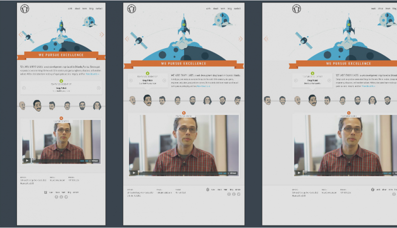
<img class="lazyImg" data-src="/_img/homepage/home_insidemt_709x399.jpg" alt="Picture of Mike Murray">
… and end up with this in your dom
<img class="lazyImg lazyImg--loaded" data-src="/_img/homepage/home_insidemt_709x399.jpg" alt="Picture of Mike Murray" src="/_img/homepage/home_insidemt_709x399.jpg">
It’s a wonderful website that keeps the size down considering that it’s trying the hard sell.
Media Temple Technical Details
Site Meta Tag
<meta name="viewport" content="width=device-width, initial-scale=1, user-scalable=no">Media Queries
@media (min-width:481px) and (max-width:767px) { }
@media (max-width:480px) { }
@media (max-width:767px) { }
@media (max-width:1224px) { }
@media (min-width:768px) and (max-width:1199px) {  }
@media (min-width:1900px) {  }
@media (min-width:1200px) {  }
@media (min-width:768px) and (max-width:1199px) and (-webkit-min-device-pixel-ratio:1.5),(min--moz-device-pixel-ratio:1.5),(-o-min-device-pixel-ratio:3/2),(min-device-pixel-ratio:1.5) { }
@media (min-width:768px) and (max-width:1199px) and (-webkit-min-device-pixel-ratio:1.5),(min--moz-device-pixel-ratio:1.5),(-o-min-device-pixel-ratio:3/2),(min-device-pixel-ratio:1.5) { }
@media (max-width:480px) and (-webkit-min-device-pixel-ratio:1.5),(min--moz-device-pixel-ratio:1.5),(-o-min-device-pixel-ratio:3/2),(min-device-pixel-ratio:1.5) {  }
@media (max-width:767px) and (-webkit-min-device-pixel-ratio:1.5),(min--moz-device-pixel-ratio:1.5),(-o-min-device-pixel-ratio:3/2),(min-device-pixel-ratio:1.5) {  }
@media (max-width:727px) { }
@media (min-width:1500px) {  }
@media (min-width:768px) and (max-width:1199px) {  }
@media (min-width:768px) and (max-width:1095px),(max-width:767px) { }
@media (min-width:768px) and (max-width:1095px) { }
@media (min-width:481px) and (max-width:767px) {  }
@media only screen and (max-width:985px) { }
@media (max-width:985px) {}
@media (min-width:1900px) {}
 A notebook you'll actually carry every day.