Design Content Conference
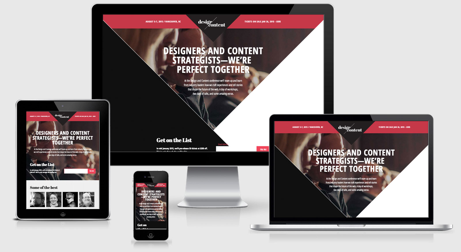
View Design Content Conference
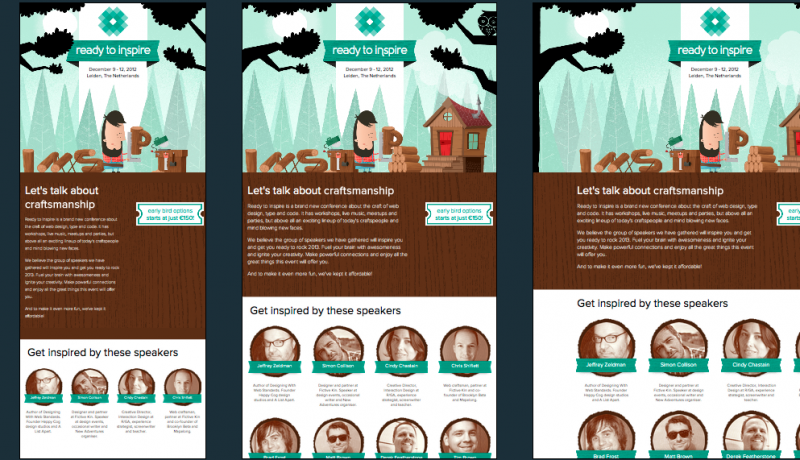
It’s great to see that a conference dedicated to designing content is so beautiful.
I noticed that in addition to Respond.js and Modernizr they were also using Match Media Polyfill until I realised that it comes bundled with respond.js…. great to know.
The site also utilises Normalise.css to make browsers render all elements more consistently and in line with modern standards.
Areas that could be reviewed:
- The html contains a reference to the main.js file, however the file is empty. This is still going to cost another http request and because it’s for JS and it hasn’t been set to async then it will halt the loading of the page while the request is completed.
- The media queries appear to be very device focussed around some typical mobile, tablet and desktop sizes. There is nothing (much) wrong with this approach if that is what the content dictates.
Design Content Conference Technical Details
Site Meta Tag
<meta name="viewport" content="width=device-width, initial-scale=1">Media Queries
@media only screen and (min-width: 320px) { }

@media only screen and (min-width: 480px) { }

@media only screen and (min-width: 768px) { }

@media only screen and (min-width: 1024px) { }

@media print { }
 A notebook you'll actually carry every day.