Brian Hoff Design
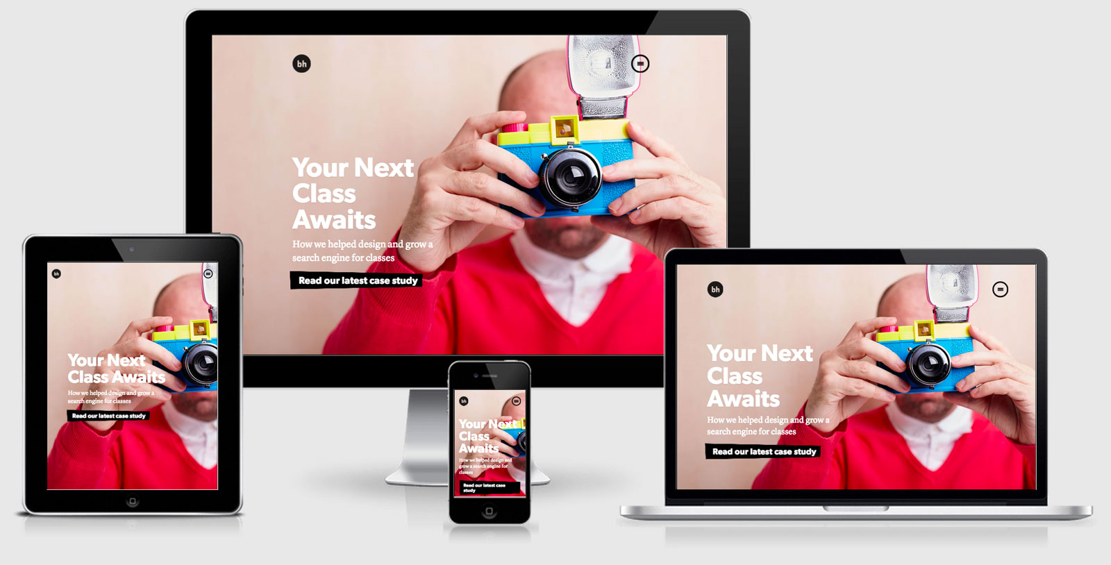
Brian Hoff Design is a beautiful responsive site. The menu is hidden at all times but screams out to be clicked across all viewports. This site really shows off the talents and capabilities of the agency.
There are a few scripts that are used that we haven’t covered here including
The good
The site is the first I’ve seen for a while that utilises separate CSS files to enable responsiveness.
   <!-- Mobile First CSS (thanks @brad_frost) -->
    <link id="style-default" rel="stylesheet" type="text/css" href="css/style.css?v48" media="screen, handheld" />
    <link id="style-enhanced" rel="stylesheet" type="text/css" href="css/enhanced.css?v47" media="screen and (min-width: 40.5em)" />
This approach means that early web browsers will only get the style.css on screens and hand held devices, whereas anyone that supports CSS3 Media Queries gets the enhanced.css.
While I see the benefits of this approach you are also punishing anyone that has a more modern browser with a double download. I assume this decision has been made based on older browsers not having as good a connection as more recent and therefore the less CSS to download the better.
The site also uses inline styles in the <head> to ensure that visitors see something immediately. This isn’t quite a Critical CSS approach, but instead it hides the site until everything has loaded before making the big reveal. This could backfire if one of the scripts don’t load and you’re left with no site at all.
The not so good
The site sets ‘user-scalable=no’ in the viewport meta tag. While it can be acknowledged that a responsive design should allow the content to be consumable across multiople viewport widths sometimes users will want to be able to zoom. This could be because the design has chosen a small base font size (not in this case) or the users eyesight requires further zooming.
Brian Hoff Design Technical Details
Site Meta Tag
<meta name="viewport" content="initial-scale=1.0, user-scalable=no">Media Queries
@media screen and (min-width:880px){ }
 media="screen and (min-width: 40.5em)" */ as part of the head /*
 A notebook you'll actually carry every day.


