Froont
Froont is a browser based visual editing interface for creating responsive designs quickly and easily… and in a visual way. It helps designers who don’t touch the code to produce some quick results, great for prototyping.
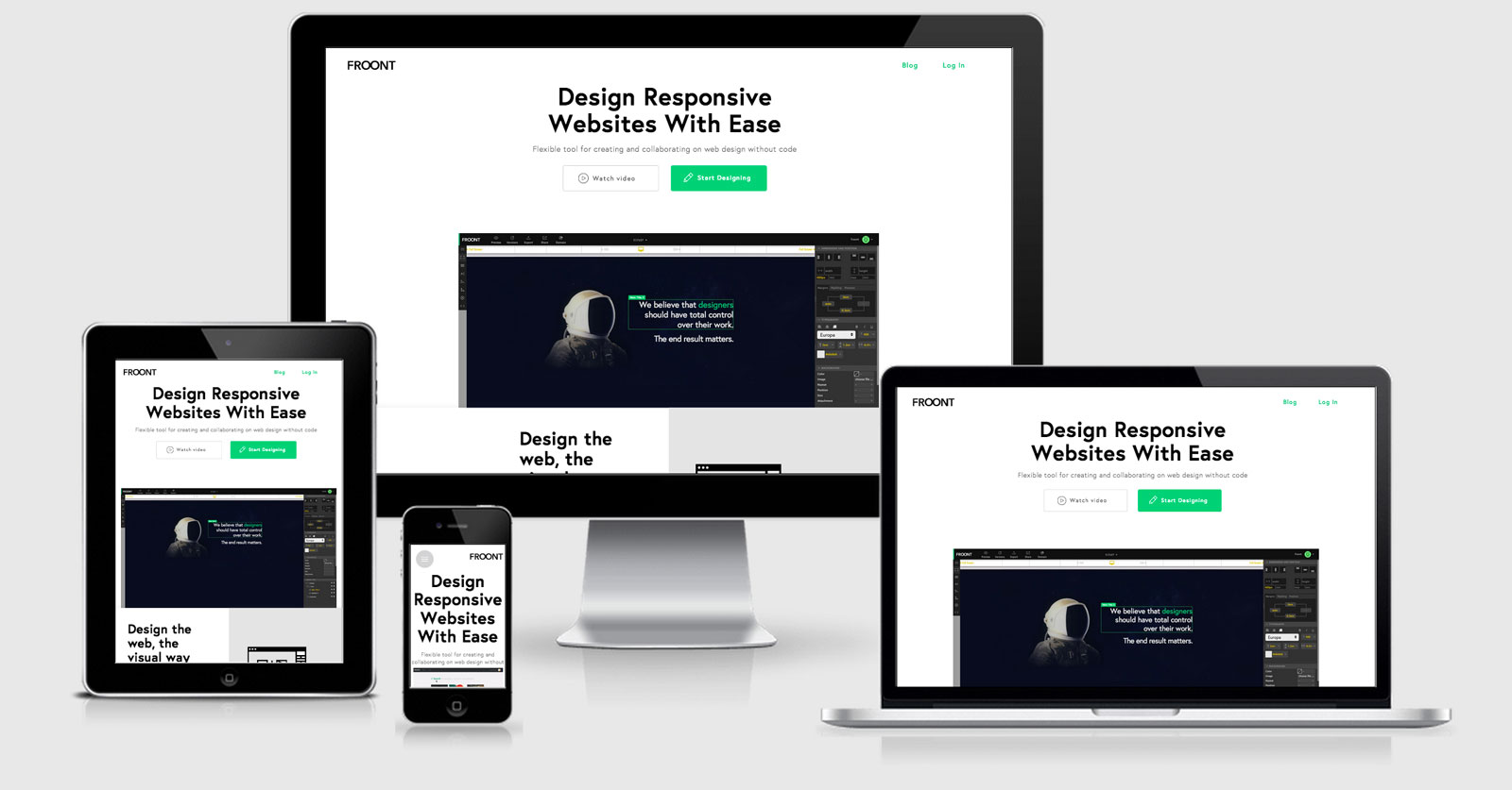
It’s a beautiful website and great example of a responsive product landing page using mostly SVG and animations to win you over on any screen size.
The Froont website has been developed using Froont itself. It uses normalise.css to to reset the CSS and it bases all of the media queries from Desktop first using max-widths. At the moment all of the media queries are grouped together (rather than something you would see if it were built using sass or less and have the media queries scattered throughout the CSS) but unfortunately it seems every style change has it’s own media query. This must be to allow further work on the design from within the app but it would be great to have an option to concatenate though.
There is some javascript doing some browser sniffing/detection however I haven’t been able to work out what the purpose of the sniffing is (update — I think it might be for font loading).
Froont Technical Details
Site Meta Tag
<meta name="viewport" content="width=device-width, initial-scale=1.0">Media Queries
@media screen and (max-width:1025px){ }

@media screen and (max-width:980px){ }

@media screen and (max-width:685px){ }

@media screen and (max-width:320px){ }
 A notebook you'll actually carry every day.


