Popular Science
I must say that it looks and reads beautifully. It’s also wonderful to see a science(y) publication site taking web design seriously. It breaks my heart every time I visit one of the NASA sites that were built circa 2005.
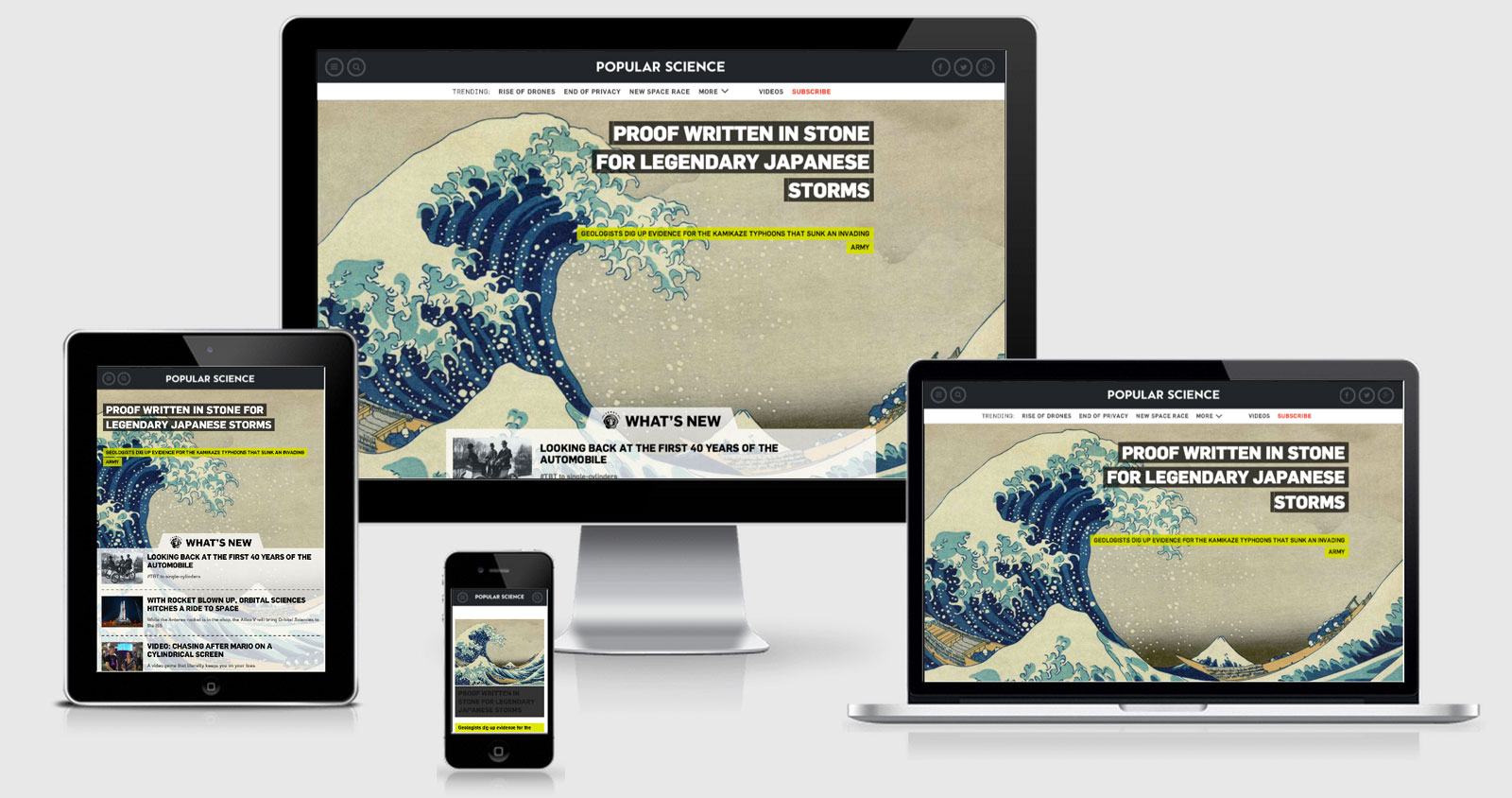
Taking a look at a few improvements that can be made on the implementation — the site sets the viewport to include maximum-scale=1 which takes the zooming capability away from anyone using a mobile device.
The media queries are based on a desktop first site, I always believe some improvements can be made by focussing on mobile first however there could be some good reasons for this. There is a point where the media queries change from screen and (max... to all and (max...., this seems a little strange
but I can only put it down to two different approaches rather than it being done deliberately.
The site looks to be running on Drupal but it seems they’re yet to activate one of the great Drupal features — the ability to concatenate all of the JS or CSS files together and save http requests.
At a point within one of the JS scripts there is a lot of device sniffing going on which is then passed across to Silverpop (marketing automation tool), so I suppose that would be considered alright if content or experience wasn’t being decided based on the results (rather than looking at device capabilities).
By default there is a parallax scrolling function on the homepage, but another script looks for IE8 or Mobile browsers and then switches that feature off. This sounds like something that could be added rather than removed given the right conditions.
There is a responsive images solution, but not one that I’ve seen before. It uses a placeholder fig and then loads in one of the data- attributes depending on the viewport width. This is hard coded into the JS so hopefully they’ll move towards the responsive image solution soon.
<img typeof="foaf:Image" width="1000" height="750" src="/sites/popsci.com/modules/bonnier/sandcastle/images/placeholder.gif" data-smsrc="http://www.popsci.com/sites/popsci.com/files/styles/small_4x3/public/custom-touts/2014/12/kanagawa3.jpg?itok=maNDBWs4" data-medsrc="http://www.popsci.com/sites/popsci.com/files/styles/medium_4x3/public/custom-touts/2014/12/kanagawa3.jpg?itok=ZXhWL9tt" data-lgsrc="http://www.popsci.com/sites/popsci.com/files/styles/large_4x3/public/custom-touts/2014/12/kanagawa3.jpg?itok=UhtD0yKp" /><noscript><img typeof="foaf:Image" width="300" height="225" src="http://www.popsci.com/sites/popsci.com/files/styles/small_4x3/public/custom-touts/2014/12/kanagawa3.jpg?itok=maNDBWs4" /></noscript></a>Popular Science Technical Details
Site Meta Tag
<meta name="viewport" content="width=device-width, initial-scale=1, maximum-scale=1" />Media Queries
@media screen and (max-width:999px){ }

@media screen and (max-width:767px){ }

@media screen and (max-width:639px){ }

@media all and (max-width:999px){ }

@media screen and (max-width:479px){}
 A notebook you'll actually carry every day.