Lots of Donuts
I love donuts. Not as much as Home Simpson, but they’re definitely up there in the list of my favourite foods.
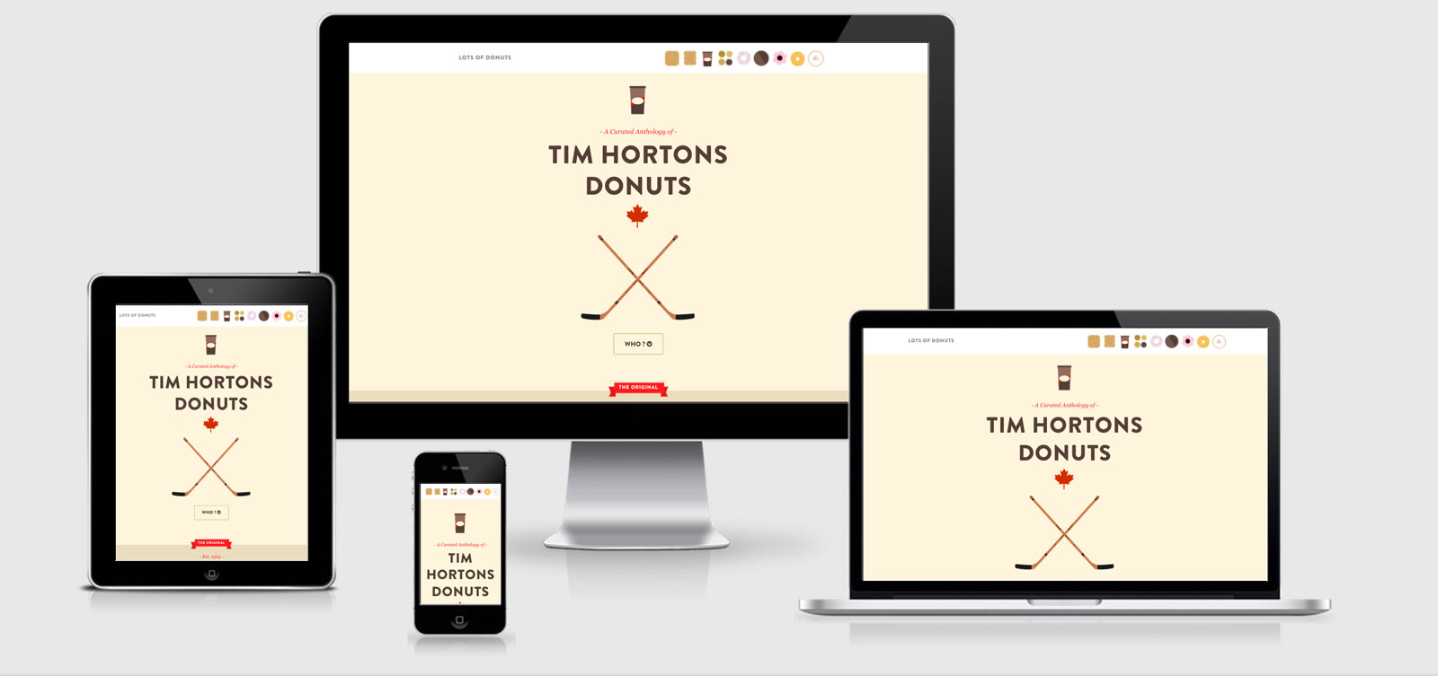
This site has a couple of interesting quirks with the first being the meta viewport declaration. There’s two of them, the first declaring:
<meta name="viewport" content="width=device-width, initial-scale=1, maximum-scale=1">
and right after it is….
<meta name="viewport" content="width=device-width,initial-scale=1" />
I wander if the second declaration cancels the first, or if the maximum scales still remains in effect. Testing on the iPhone 5 I was able to zoom slightly, but not as much as I would think. This does cause issues with the main navigation (pictures of donuts) as they also zoom in and we’re not
left with a very nice interface.
The images in the header are just that… images. They have a data-href attached to the image tag which then hooks up as navigation once the JS fires. Two things that could be improved here would be to wrap them with <a> tags so that they work as anchor links if JS doesn’t fire (a good start for progressive enhancement). The second thing would
be to introduce the srcset 2x descriptor to load in larger icons for retina/high dpi screens. It does use retina.js to load these in, but now a days you will be better coverage using picturefill and the srcset.
The grid is is using nth-child to set the final columns margin to 0, I kinda like this kind of thing although you could set the margin to 0 always and use padding for the margin and rely on the box-sizing:border-box; to keep the measurements easy.
JParallax.js is used for some parallax effects, and Flex Slider styles are included within the CSS although there’s no sign of using flex slider on the site itself.
Lots of Donuts Technical Details
Site Meta Tag
<>Media Queries
@media only screen and (min-width: 1300px) {}
@media screen and (max-width: 860px) { }
@media screen and (max-width: 650px) { }
@media screen and (max-width: 480px) { }
@media (min--moz-device-pixel-ratio: 1.3), (-o-min-device-pixel-ratio: 2.6 / 2), (-webkit-min-device-pixel-ratio: 1.3), (min-device-pixel-ratio: 1.3), (min-resolution: 1.3dppx) { }
@media screen and (min-width: 768px) { }
@media screen and (min-width: 480px) and (max-width: 768px) { }
 A notebook you'll actually carry every day.