Rally Interactive
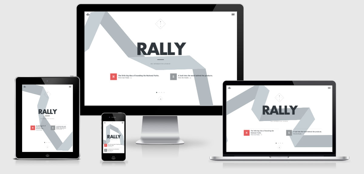
This is a really beautifully designed responsive site. As you can see from the number of breakpoints included they have taken a lot of care to ensure that the site looks great across a number of different viewports and devices.
The JS is very much linted and compressed so there wasn’t a lot I could find out about how things are working, but they are using modernizr to ensure the right experience is had by all.
On the case study pages, such as National Parks, they employ a lazy load technique for the images by adding the image to a data-src attribute and using a data/uri to load in a blank gif on the page load. The device chrome that surrounds the images are done through CSS as background images so this can be changed from 2x to 1x depending on the device DPI.
Rally Interactive Technical Details
Site Meta Tag
<meta name="viewport" content="width=device-width, initial-scale=1.0, maximum-scale=1.0, user-scalable=0, minimal-ui" />Media Queries
@media (min-width:768px){}
@media (min-width:480px) { }
@media (min-width:640px) {}
@media (min-width:768px) {}
@media(min-width:900px) { }
@media(min-width:1260px) { }
@media(min-width:1440px) { }
@media(min-width:768px) and (min-height:990px) { }
@media(min-width:768px) and (min-height:1164px) { }
@media(min-width:768px) and (min-height:660px) {}
@media(min-width:768px) and (min-height:920px) {}
@media(min-width:768px) and (min-height:1164px) {}
@media(min-width:768px) and (max-height:620px) {}
@media(min-width:1080px) {}
@media(min-width:1080px) and (max-height:920px) {}
@media(-webkit-min-device-pixel-ratio:2),(min-resolution:192dpi){}
 A notebook you'll actually carry every day.


