Building a Scrapbook Layout with CSS Grid
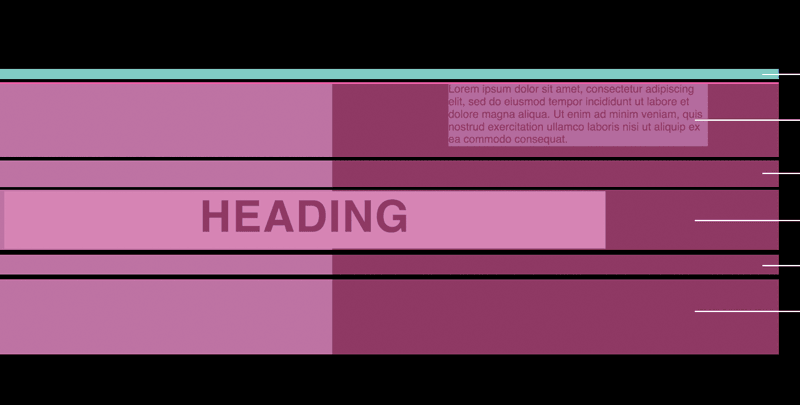
A compound grid is when you have two grids, like a 5 column and a 4 column, and you overlay them together. What does that have to do with Scrapbook layouts? Well, this is the grid that Michelle used to build the scrapbook and she even built this little tool on code pen that will help develop them.
I love the approach to this particular grid layout because Michelle employs CSS Variables to control the row track sizes. It might be a little confusing to start with, but take the time to understand what is happening here because it will open up a world of opportunity for your future web designs.
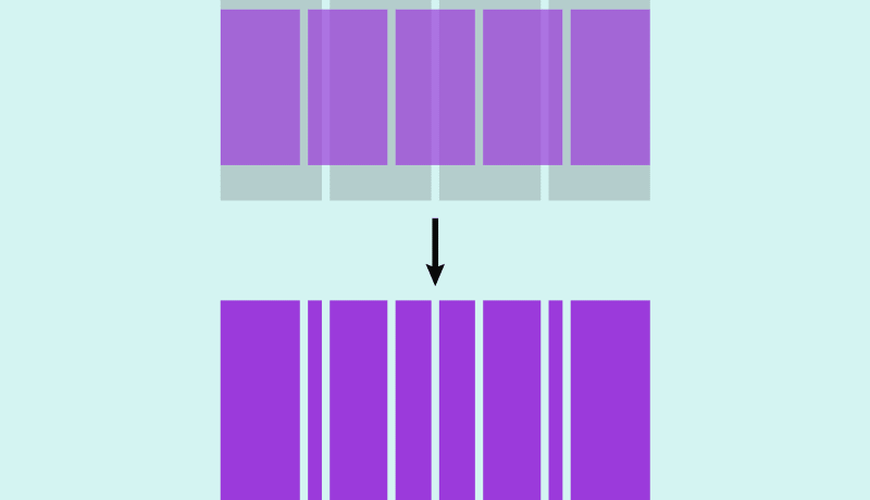
Most of us are probably familiar with using grids in some way for web design and development. Virtually all website designs I’ve been handed to build have hung on a standard 12-column (or occasionally 24-column!) grid, with all columns an equal width. So far, so predictable.
Compound grids, on the other hand, are created by layering two or more grids. Juxtapositions such as a 5-column grid superimposed onto a 4-column grid produce rhythmic patterns, and open up more dynamic layout possibilities than a regular grid.
An excerpt from Building a Scrapbook Layout with CSS Grid
 A notebook you'll actually carry every day.
