Responsive Tables
Tables are quick to break your responsive layouts, especially on smaller screens. This simple JS/CSS combo from Zurb Foundation will let your tables adapt to small device screens without everything going to hell.
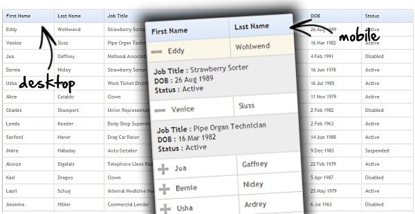
Why they built this
There were three main areas that Zurb were trying to solve with this technique for tables. They were to ensure that it:
- Doesn’t break responsive layouts
- Doesn’t unnecessarily hide data
- Still lets you compare rows
With that in mind they have created some JS & CSS that works by taking the first column and “pinning” it to the left of the table, allowing you to scroll the other columns under it. You don’t lose the likely key for each row, but you also don’t have to break your nice responsive layout.
How to Make Your Tables Responsive
We wanted this to be incredibly easy to implement. Start by downloading the code pack — this includes a demo file as well as the two key files you need for this: responsive-tables.js and responsive-tables.css.
<link rel="stylesheet" href="responsive-tables.css"> <script src="stylesheet" href="responsive-tables.js"</script>
Attach to Your Markup
On any data table in your markup, you simply need to attach a class of .responsive and the CSS/JS will do the rest. Like so:
<table class="responsive"> <tr> …
See the Pen Responsive Table Example by Justin Avery (@justincavery) on CodePen.
 A notebook you'll actually carry every day.