Grolsch
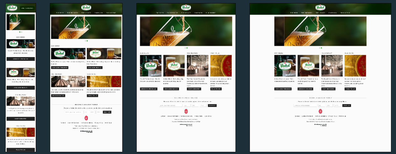
Groslch is a beautifully made responsive design focussing as much on the space on the page as they do on the content itself.
Using a range of Javascript shims to bring modern day capabilities to as many users as possible Grolsch has a very nice clean and beautifully responsive site.
Grolsch Technical Details
Site Meta Tag
<>Media Queries
@media (max-width: 767px)
@media (min-width: 768px) and (max-width: 979px)
@media (max-width: 480px)
@media (min-width: 978px) and (max-width: 1280px)
@media (-webkit-min-device-pixel-ratio: 2)
 A notebook you'll actually carry every day.


