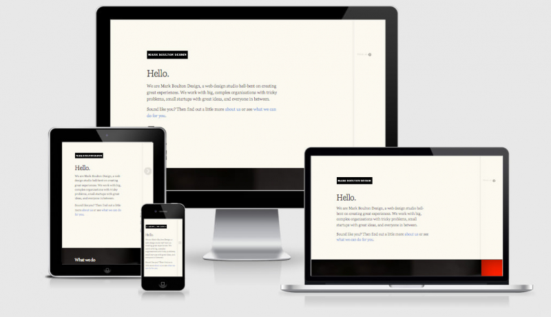
Am I Responsive is a high fidelity responsive design tool for previewing your site across a variety of popular devices. This is not a tool for testing, it is really important that you do that on real devices. This instead is a tool for quick screenshots (for me) and to visually allow people to “get” what you mean in client meetings.
I take a lot of screen shots of the various device breakpoints for responsive design and it takes a while to prepare them. This tools allows me to get what I need quickly, and hopefully it can be helpful for showing your more visual clients what you mean by responsive design when a suite of products
isn’t at the ready.
How it works
Add your URL to the input field and press GO! to see how your website looks across a few different viewports.
Viewports
Desktop
1600x992px scaled down to
scale(0.3181)
Laptop
1280x802px scaled down to
scale(0.277)
Tablet
768x1024px scaled down to
scale(0.219)
Mobile
320x480px scaled down to
scale(0.219)
A note on the vieports
The viewports I have chosen are based on the devices that were a part of the responsive PSD layout I previously bought, and yes they are all Apple. Apologies to all the Android fans out there, I’m sure a few of you have the “Android has a bigger market share” argument in mind but although you’re right I just didn’t have that suite of images when I started. If there’s enough of a desire I could do a suite of other products, but I’m just not sure if adding those will improve the basic function of the tool.
 A notebook you'll actually carry every day.

