A notebook you'll actually carry every day.
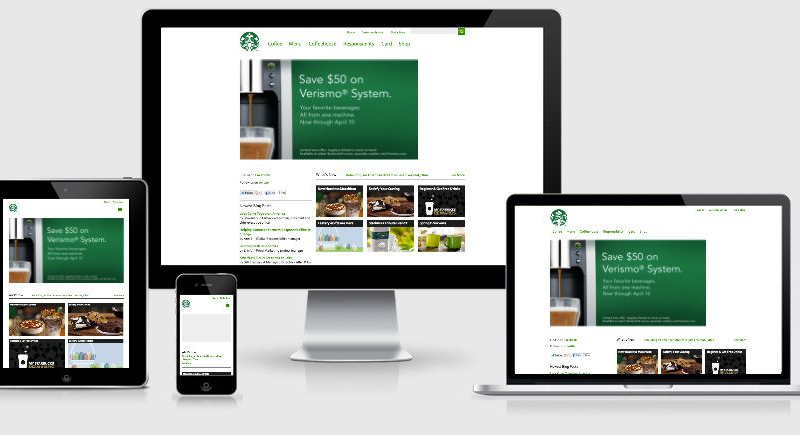
We all know that mediaqueries are the corner stone of responsive design, however just where and how you enable each media query depends on your implementation.
With responsive design still in its infancy there are many techniques that are being used to deliver the right CSS to the right breakpoint.
You could
- Use Javascript to serve relevant CSS files
- Use media=”” tag within the header <link>
- Use @media within the CSS file
- Use a mixture of all the above.
An example of option 2
<link rel="stylesheet" href="/css/base.css">
<link rel="stylesheet" media="screen and (min-width: 45em)" href="/css/widescreen.css">