A notebook you'll actually carry every day.
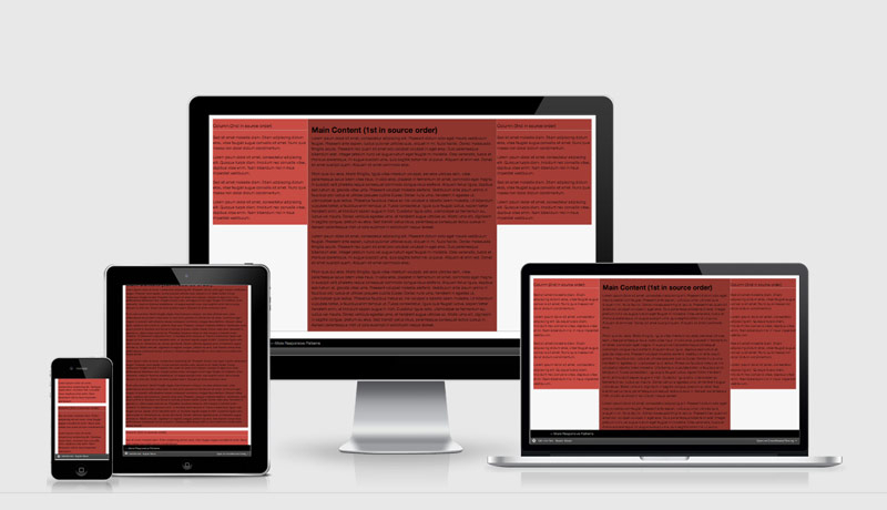
Approaching a responsive page layout is different to approaching a fixed width layout. We previously enjoyed these fixed widths because it gave us a constrained canvas to work with, but now with Responsive Design we have to throw that constraint out and be flexible with out approach.
The most important thing to remember is going from a small screen up is much easier than trying to squish a large screen down. This is what we refer to as Mobile First responsive web design.
Mobile First page layout
By starting with a mobile first, or a single tube of content, it forces you and the stakeholders to make decisions about what is most important on the page… because you can’t fall back to having things next to each other on a horizontal plain.
A single tube forces you to define the hierarchy of each page giving us back that constraint we had lost when we went responsive.